Letter Photography
A
D
G
J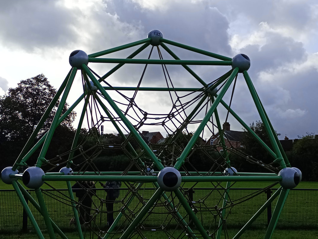
M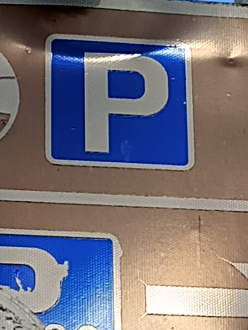
P
S
V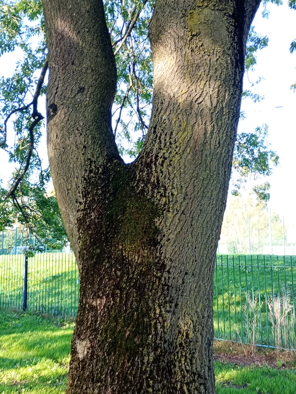
Y |
B
E
H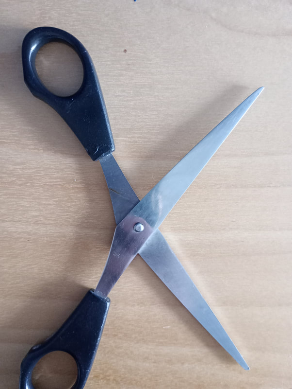
K
N
Q
TW
Z |

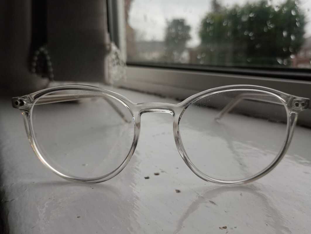
C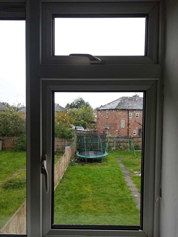
F
I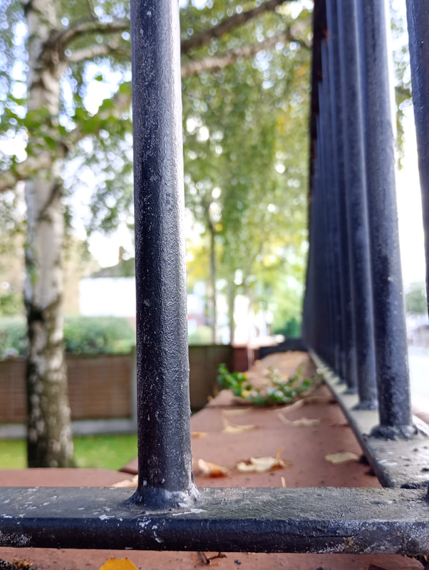
L
O
R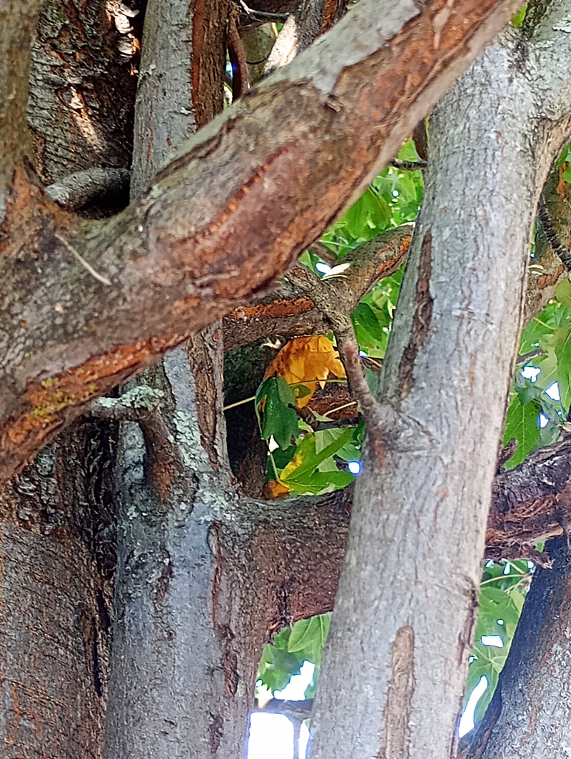
U
X |
Best and Worst
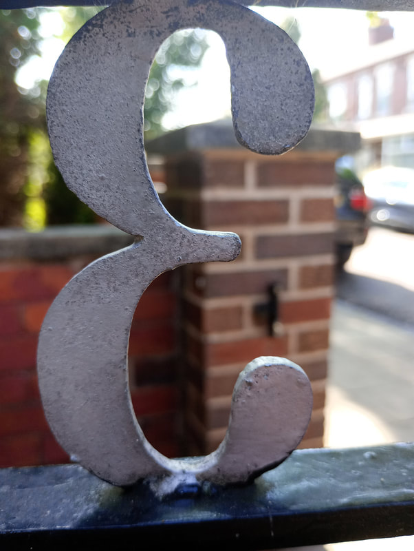
I believe this is my best image. This image is of the letter 'E' and I think its really noticeable. The way i have cropped this image really makes the letter stand out by not having many distracting objects while your eye finds the letter. I also think that my use of the shallow depth of field really helps define the 'E' and irradiates most of the distractions in the background.
|

In my opinion, this is my worst photo because theirs way too much going on and the 'U' is barely noticeable due to the other branches covering it. It isnt angled in a way which highlights the letter 'U'.
|


